work
Stanfield Capital
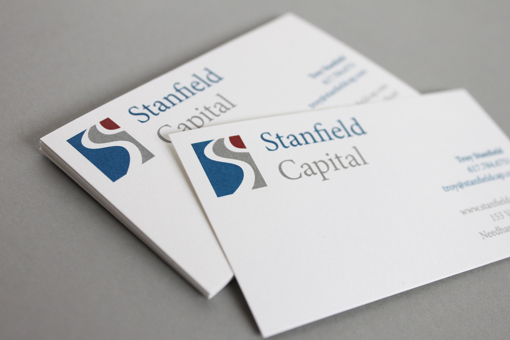
Logo development
Stanfield Capital is a private equity firm focused on investment opportunities in the lower middle market. The logo we developed is a graphic that simultaneously depicts the letters SC and mimics a flag or banner in the wind. This graphic, along with the color palette and font choice, helps to position the firm as a nimble, forward-thinking investment group that is founded in reliable analysis.
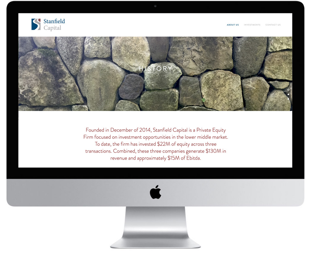
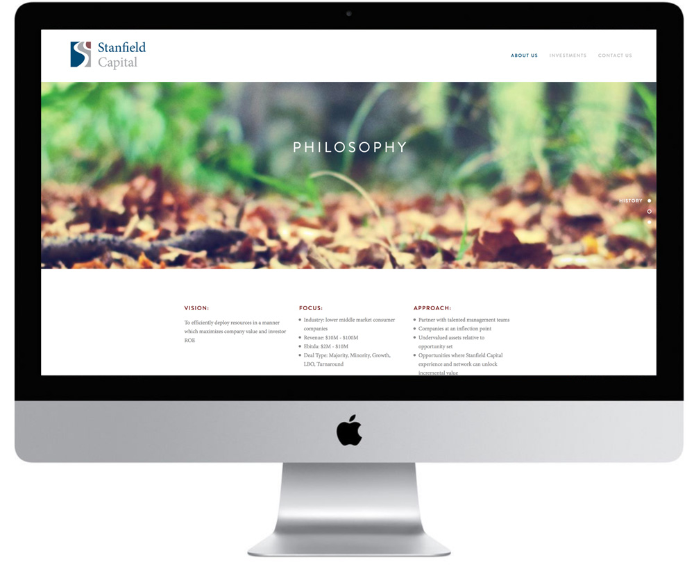
website design & production
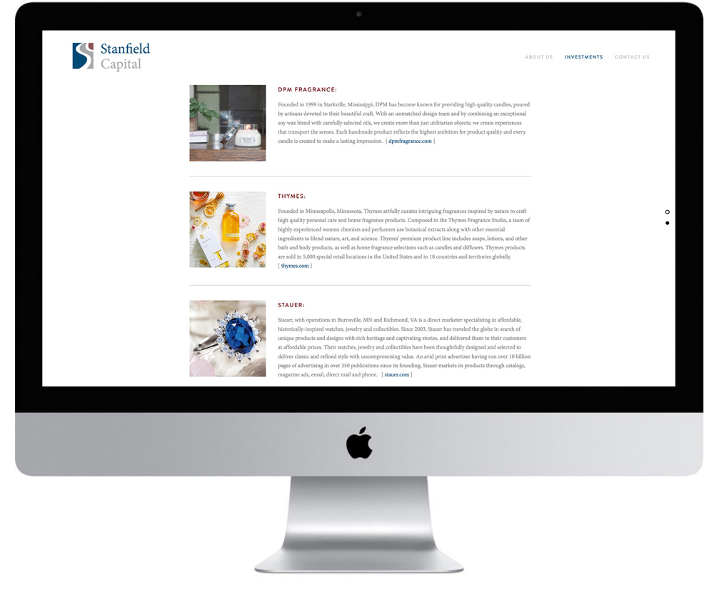
A website was designed and produced to help introduce the firm. Images of New England – including the Boston skyline – were selected to help anchor the firm in its surroundings. These images suggest a tried and true philosophy for the firm that is based on sound investment principles. In contrast to the old world reliability suggested by the image choices, the site design employs an arresting parallax effect to remind us that new thinking and analysis are a big part of the picture as well.
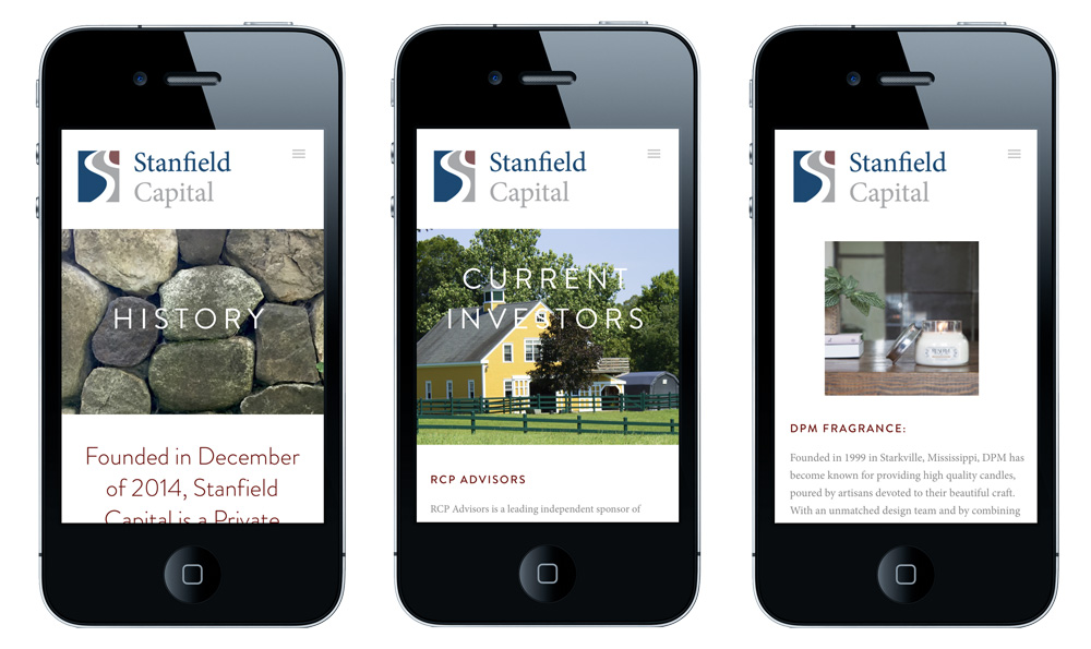
responsive design
The site was designed to be fully-responsive and is therefore equally accessible for mobile devices and tablets across all browsers.