
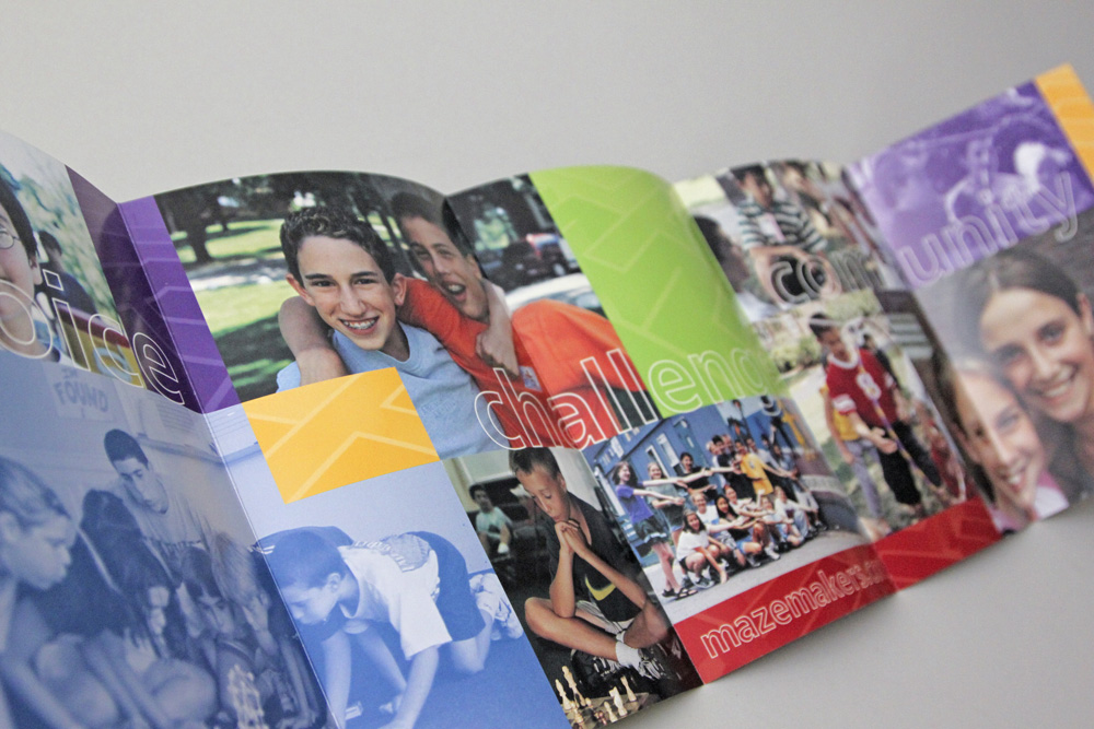
Mazemakers is a small, dynamic learning community of young people entering grades two through eight. Participants choose their own courses and projects, challenging themselves and each other in cooperative problem solving.
camp brochure
Mazemakers needed a marketing piece but were constrained by a limited budget and very little time. By employing creative use of existing (non-professional) photography and stock art we designed a brochure that successfully communicated Mazemakers’ unique appeal.
The camp’s values of creativity, choice, challenge, and community are all clearly articulated here.
logo design
A logo was designed to be a recognizable mark for the camp wherever it appears. The Mazemakers’ “M” is a path through a maze tilted on its side.
The mark is clearly recognizable and was “step one” in establishing the camp’s brand.
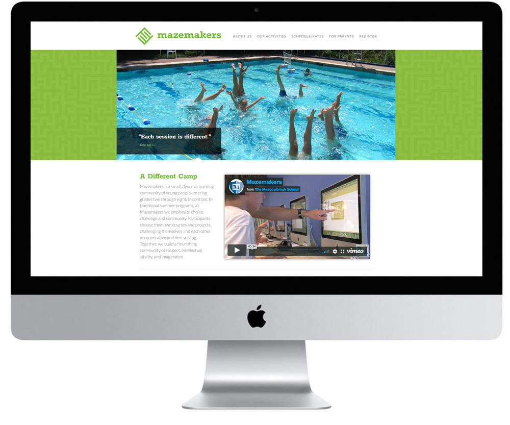
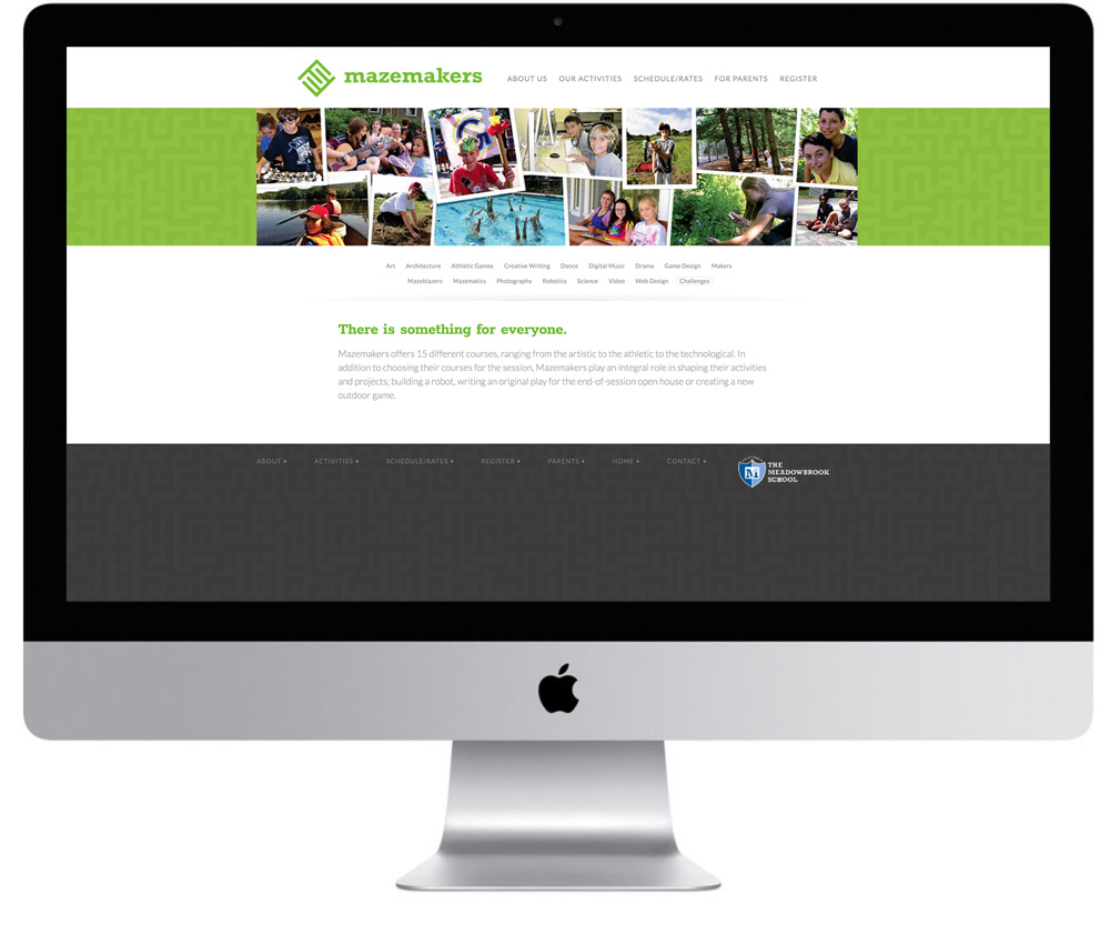
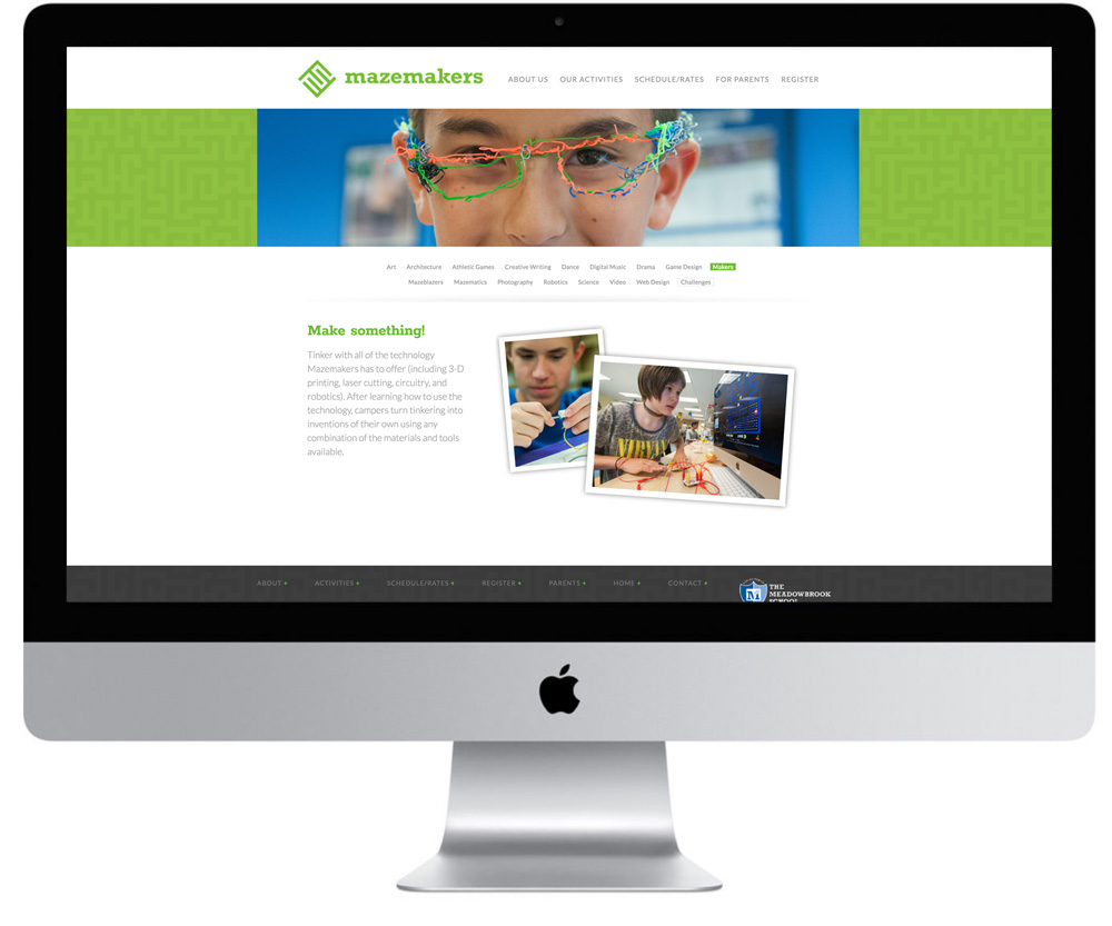
website design & production
The Mazemakers website goes into great detail about the camp’s offerings. A very clean and clear typogrphic hierarchy is established to help users navigate a wealth of information about the camp. The design motif of a never-ending maze is repeated across the browser window behind the banner images and across the footer. This helps to provide visual consistency and further reinforce the brand.
Award-winning design for discerning clients since 1994